Wednesday, October 22, 2014

Wedding of Fida and Ziad


Nuptials befitting royalty were held at Saint Mary's  Orthodox Christian Church in Omaha, Nebraska featuring a glamorous array of white, pink, and a touch of accenting purple. 


We created the bride's bouquet to sparkle during the candle lit service with silver leaves tucked beneath orchids, roses and freesia. 


Garden roses and hydrangea  graced the reception banquet tables in the Blackstone Ballroom at the Hilton down town.


The bridesmaids' bouquets became featured pieces for the serving tables, easily becoming part of  the decor while giving the ladies a place to set them. 


Wednesday, October 8, 2014

Autumn Outdoor Wedding


The crisp air and the elegant colors of early Fall provide the perfect backdrop for an outdoor wedding. Sophisticated romance never looked so lovely as this wedding we had the pleasure of designing for.


This beautiful event took place at Elmwood Park pavillion, which features already picturesque facilities. The location provided ample opportunities for unique designs that varied from simple to grandiose.


The natural ambiance of the park required little embellishment, so we accented the surroundings with pops of orange, red, blue, and yellow to bring in the couple's wedding colors.


Tuesday, October 7, 2014

Niches


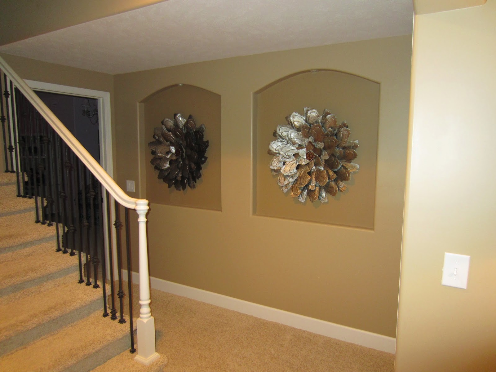
Builders seem to love putting niches in new houses. Each niche provides all kinds of decorating possibilities and we always enjoy finding new solutions for them. These two wrought metal wall flowers fill each space while standing out with distinction. They also create an artistic backdrop for the staircase.
Monday, October 6, 2014

Edit and Refresh


Sometimes it's not what you add to a room, but what you edit! This living room corner is the perfect example. We re-positioned this console table elsewhere in the home to add height to the space. Then, we brought a silver chest in from another room and placed an elegant glamour lamp alongside some silver accents. 


We brought in the chair to make the corner cozy, then traded the art to make the look complete and different. Editing is an easy, cost effective solution to creating an entirely new look  in your home. Get inspired with more pictures from our website!

Thursday, October 2, 2014

Creating a Lovely Living Space


Our homeowner knew a formal dining room wasn't needed for her family, a living room was better suited for their comforts. To create the space she wanted, we started with two custom blue chairs already existing in another room and pulled the red rug to reveal a "tile" rug.


Next, we brought a mirror topped coffee table to anchor the conversation area. One large piece of transitional blue art from our showroom brought sophistication. We retired the ficus tree and replaced it with an existing vase of bamboo to add the dramatic pause we needed. An unused dining room soon became a comfortable conversation space.

Monday, September 22, 2014

Create a Space for Conversation


When designing your living space, remember to give everyone and everything a place. Put chairs closer to each other for conversation and invite guests to set things down by placing a table next to or between them. We applied this idea to our client's home to create a relaxed space.


 A strategically placed red tray with soft foliage on the ottoman allowed a convenient spot for the remote. We then placed solid colored pillows that had different textures on the sectional to update the look without fighting with the patterned rug.

Casual family rooms function best with side tables for resting snacks, chairs within talking distance of each other, and designated spots for devices to create ease and comfort.


Monday, September 15, 2014

Welcome Them In


The decor in any home's entry presents the first impression of our sense of style.  A table with the right lamp is generally accepted as great ambiance. However, this table was relocated to a more appropriate scaled space, which made way for a new setting.


We brought a round table with iron legs to the entry space to speak to the iron details in the staircase and door trim. We then placed a much larger lamp and positioned the perfect red chair in front of larger scale art that we borrowed from another room. A beautiful silk orchid design was the perfect softener to the area and completed the inviting look.


We re purposed our client's entry table by putting it behind her sectional in the family room where it lent separation from the kitchen space. Our client's additional accessories topped the demi-lune table to add to the well lived room.

By introducing one or two new items and arranging pieces our client already had, we made a friendly, inviting place to welcome guests in.