Showing posts with label Room by Room. Show all posts

Monday, June 1, 2015

Scarcely Filled Wall Gets Function and Style


The homeowners knew something was needed in this space with under scaled art, but had functioning issues that needed to be addressed as well.  This was a "drop zone" coming in from the garage that shared space with the kitchen. We needed a surface on which to set mail, keys, etc. and it needed to be beautiful to look at.


"Contemporary and not an image" was the request for art. Our job was to coordinate finishes and scale it accordingly. This mixed metals composition did the trick.
The buffet was brought in to house a few drop zone essentials and a place for extra lighting. We framed the entire wall's composition by picking a lamp with a contemporary curve that speaks to the art but completes the whole frame.
A large scaled ceramic tray with silver fruits reveals the simple clean line message the clients wanted for their existing space.

Monday, May 25, 2015

Kitchen Collection Part 2


A wood tray was filled with pomegranates, artichokes and soft grasses to make a focal point in a kitchen/hearth room. All the finishes were considered; such as the wood table, iron chandelier and fabric covered chairs before picking the materials for this custom design.


Monday, May 18, 2015

Kitchen Collection Part 1


There is musicality in designing above kitchen cabinets; a delicate balance between filling the entire space and not filling it out enough. A certain rhythm must be achieved with the right accessories to achieve a great composition.


A pair of large scale jugs were brought in for proportion and color. Larger plates and a new position for the grasses make for the beat we were looking for. A Mackinzie-Childs tea kettle was given a few red blooms for a final touch.

Monday, May 11, 2015

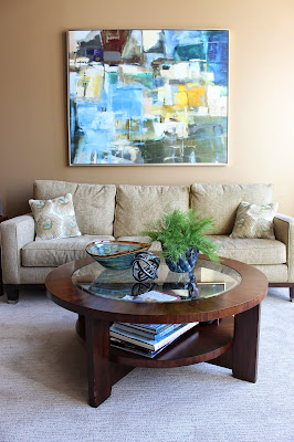
Coffee Table Talk 2


Coffee table accessories follow my general rule (not broken this time) of making the best of the rule of threes. I usually, but not always, like three different objects on a surface.


I try to vary the heights and bring color at the same time. In this case, the soft fern juxtaposes the hard slick surface of the glass bowl and knot sculpture, which relates to the glass top surface of the table. All of these elements compliment the wall behind the sofa, which was crying for one large piece of colorful art. Just a few new pieces made for a transitional and alive living room.

Monday, May 4, 2015

Coffee Table Talk


Simply stated, sometimes the perfect solution to a large coffee table is one large vase with monochromatic bright color (as in the red poppies) to make the room come alive.


It shouldn't have to compete for attention with other objects. The poppies make a year round statement, but can be easily lifted out of the vase to make room for fall and holiday stems later.

Monday, April 27, 2015

Powder Room Restyled


Bathrooms are generally utilitarian spaces, first and foremost they must function well. I think they must feel clean, organized, and (ideally) beautiful! 


We achieved the crowning touch in this powder room with a natural looking silk orchid nestled in a glass wall vase wrapped in iron. The three dimensional design brings a soft element to hard surfaces and compliments the flat art on the opposing wall.


Monday, April 20, 2015

Perfect Passageways Part 2


Niches are fun little alcoves to which we can bring the perfect design. Moving this homeowner's art to another location made room for our parallel design of over-scaled dandelions and kangaroo paws. Sometimes three dimensional designs work best in small pass through areas such as this. The requirement was to "make it fun and happy"; mission accomplished!


Monday, April 6, 2015

Custom Glamour


Serenity reigns in the master suite with soothing orchids. We went on site and removed tired silk flowers to make way for a new spa inspired arrangement, rejuvenating the container.


Monday, March 30, 2015

Dining Table Solutions


This table needed a fresh looking timeless centerpiece. Our solution was botanically correct silk phalaenopsis orchids with green accents in a classic urn. This is more cost effective than having a fresh centerpiece every week or even keeping a plant alive. The white orchids awaken the senses while working with the fabric colors without trying to match them.


Monday, March 23, 2015

Getting the Party Started


 The party starts with a good conversation group. Our client wanted a living and game room space that naturally attracts guests to gather. Because the room does not have a television, we changed the furniture grouping from a theater style to a cozy circle more suitable for socializing and games.


Adding a live palm warmed the space; creating an inviting atmosphere. We positioned side tables to accommodate drinks or snacks as well as a lamp for additional lighting. Our client wanted to include two beloved art pieces from his travels, so we chose accent jars for the tables to bring their aqua hues into the space. Turquoise vases continued the accent color and balanced the mantle space. We finished the look with a silk ivy plant harmoniously grouped with candlesticks on the coffee table. This beautiful, simple space will invite guests to gather for years to come.  


Monday, March 16, 2015

Monday, March 9, 2015

Refined Home office: Part 3


A new tall cut work black bookcase was added to accentuate the tall ceilings and holds books as well as frames. A few chunky accessories broke up the monotony of all reading material and created interest.


The homeowners' chair was re-positioned to face the desk. A soft gold throw brings out the wall
 color, a flower pillow brings texture and contrast. We gathered family photos from every wall, making one collage composition to state the importance of the collection.

Monday, February 23, 2015

Refined Home Office: Part 1


A young professional couple was ready for a grown up elegant office that spoke of sophistication. We used an existing chair, kept the family art, and re-purposed a few things. However, most of the furniture needed updating. We started with a timeless rug under a solid black desk and a new upholstered chair as the anchor of the room.  


A girthy black lamp with a soft pleated shade appealed to both husband and wife. This was exactly what the room needed for function and scale.

Friday, August 23, 2013

Room by Room: Kitchen


A neutral color palette in this kitchen beckons for a splash of color behind glass cabinets. Three red vases bring harmony and balance to the wall of cabinetry. An exclamation point is achieved with a spectacular urn of orchids and orbs on the kitchen table. A brown texturized runner connects the design to the large table. Without a chandelier the sky is the limit!